Walls are Canvases: The Nelson-Atkins Museum of Art
We people in Kansas City may be far away from IKEAs, but we do have the awesome-dee-dawsome Nelson-Atkins Museum of Art. I went last Sunday, along with my philistine Asian scientist dad (who periodically made amusing comments of disapproval during the trip), to check out the collections of Western art. Previously, I had only seen the second floor of their impressive Asian collections, but this time–as a newly-awakened design enthusiast–I wanted to carefully soak in the different eras of European and American work that provided the artistic context of furniture design. As I browsed, looking at all the aesthetics with large, enamored eyes, I realized that there were tons of inspirations that people could take back to their living spaces. Art is always an inspiration for living spaces, and museums are like huge catalogs for your home. What stood out to me, however, was the amazing use of color in the exhibitions.
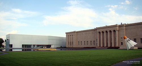
The Nelson-Atkins Museum of Art. The building on the left is the Bloch Building and appropriately houses the modern and contemporary art. (Photo Credit: Flickr-Rock Chalk Jayhawk Cartographer/John Roever)
If you’re thinking about putting up art on your barren walls and painting them for a dramatic flair, and you’re not sure how to pair artwork with paint colors to evoke the proper mood, there is no better place to look for inspiration than an art museum. Exhibition designers at the Nelson-Atkins expertly set dramatic Baroques to darker, moody reds while putting pastoral, peaceful works to a darker teals. See how the bold lighting, shadows, and colors are accentuated by the wall color and dark gold frame. In your own home, this makes for great combination for a romantic bedroom or dining room.

Saint John the Baptist in the Wilderness by Caravaggio (Photo Credit: Flickr ocad123)
Or if you prefer something calmer, pick a more pastoral piece with a cool, dark backdrop and frame.
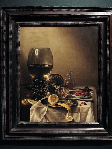
Still Life by Pieter Claesz (Photo Credit: Flickr-ocad123)
This blue below is great for adding a royal flair to more traditional, colonial rooms. Paintings here have lighter, more playful tones, which work well with the lighter frames and lighter paint. Just look at how the blue walls, golden frames, and polished, wooden high boy with the gold handles all harmonize splendidly together. Delish!

18th-19th Century American Exhibition at the Nelson-Atkins
Art and wall color. Peanut butter and jelly. Come visit Kansas City and our art museums!-Beryl