Posts tagged wall decor
Retro Decor For Your Home
Creating a Hollywood Glamour / Mad Men Era / Retro home environment is a great way to add excitement to your home thanks to the bright colors, engaging patterns and the funky feel that are pertinent to the style of the 1960’s. Don’t be shy, show your nostalgia for one of they greatest decades…here are some ideas for how you can get the retro look at home.
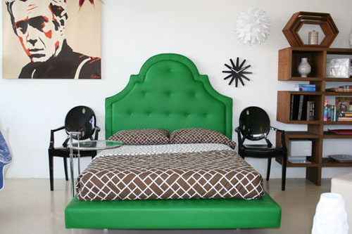
Incorporate curved period style furniture into your home. Curved upholstery in bold colors or geographic prints fit right into the 1960’s period design scheme. A curved headboard is a great way to accomplish the 60’s vibe. This bedroom is made complete with the graphic print bedding, side chairs, graphic artworks and honeycomb decorative details.
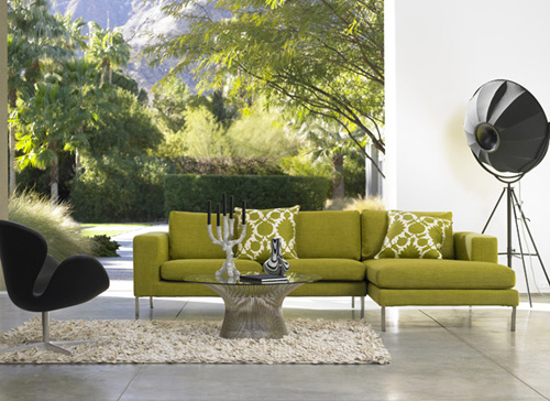
Add feature furniture to your living room. Buy a retro sofa and side chair that are so brilliant they deserve to be the center of attention. Play down all surrounding decor and furnishing to help ‘feature’ the furniture. Keep walls and rugs neutral in color to complete the look.
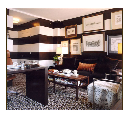
Paint walls with bold stripes, creating a two-tone effect using one dramatic hue for pure impact (black and white is solid choice). Finish the look by adding statement decor, and solid color furniture.
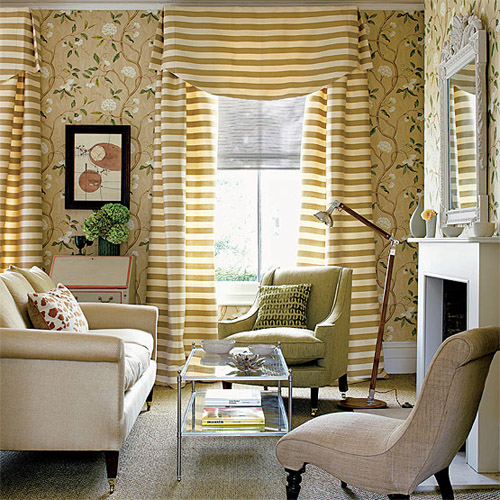
Mix and match patterns to successfully complete the vintage family room scheme. Make sure the mix and match color palette is complementary. Geographic prints should be mixed with other graphic prints, stripes and solid colors. While florals should be mixed with other florals, stripes and solids.
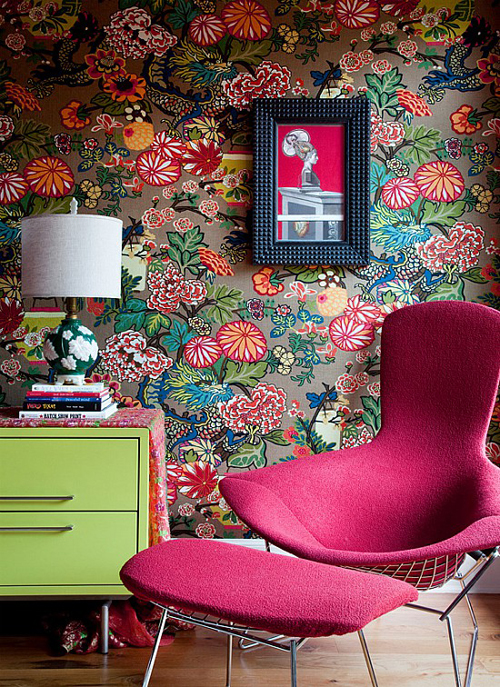
Choose large scale floral prints for your walls and fabric. The floral wallpaper effect is best pulled off on high-ceiling rooms because they have more space to display the pattern. Keep color palettes simple in rooms with colorful floral prints.
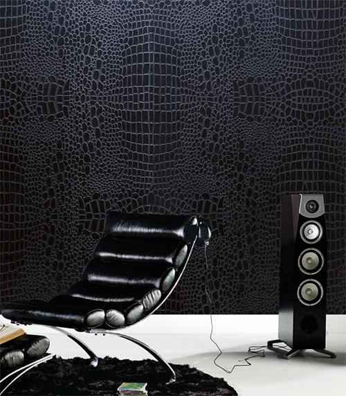
Give your wall a 3D effect with textured wallpapers. Textures create the perfect amount of stylishness without looking over done. This is my favorite look from the 60’s. Someday my house will be covered with textured walls (and hopefully leather walls).
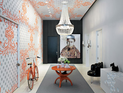
Incorporate a statement chandelier for the ultimate Hollywood glamour lighting.
To make your home decor interesting, learn about more Hollywood Glamour styles at UKTV and try to reinterpret them with help of modern materials. Or you can do the opposite and try and make modern things look a bit retro!
Honeycombs In Your Home
Hi there! I’m Jessica, a writer for Arcadian Lighting. Every day I get to discover beautiful, inspiring interior design ideas and light fixtures, and then get to share them with blogs like Style Bust.
I’m going to be sharing a wonderful design trend that first became popular in the 1960’s – honeycomb patterns! They’re fun, versatile, and classic. I hope you enjoy!
These creative DIY honeycomb shaped shelves combine style with functionality. The geometric honeycomb shape is interesting and unique, while also providing cute little ‘nooks’ to display your favorite pieces of artwork, tchotchkes, knick knacks or photos.
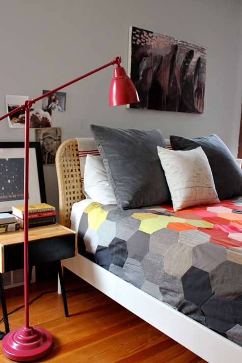
A colorful honeycomb patterned quilt gives this bedroom a fun, vintage feel. The quilt was made using old clothing – a perfect way to recycle what you already have, while making a colorful accent for your bedroom. The red floor lamp is just the right color for this room, as well.
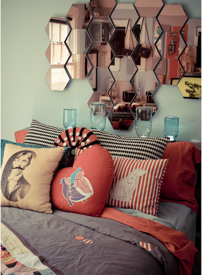
This very eclectic bedroom features a honeycomb mirror that’s offbeat and unexpected. I love all the quirky accents, especially the strange pillows.
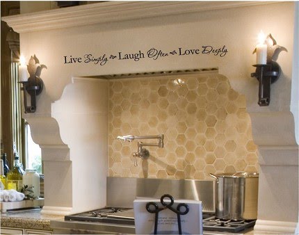
The neutral colored honeycomb backsplash in this kitchen is an interesting accent that draws on the ‘homey’ feeling of a beehive. I particularly like the modern touch of adding written words above the stove.
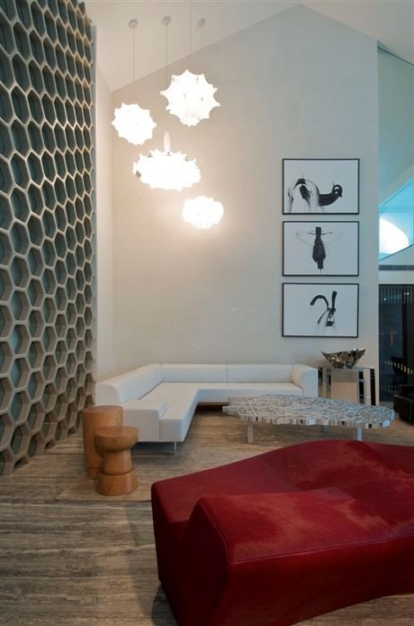
This cool and contemporary living room features a whole wall of honeycomb patterns in a fresh grey and pale blue palette. Random ‘combs’ have clear glass panels, allowing a fun way to see through to the next room. The organic shaped pendant lights are a clever touch, as well.
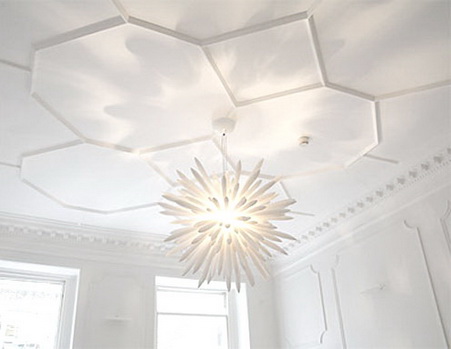
Honeycomb moulding is a particularly stylish and unexpected accent in any room. This ceiling adds a bit of texture and interest to what appears to be an all-white room.
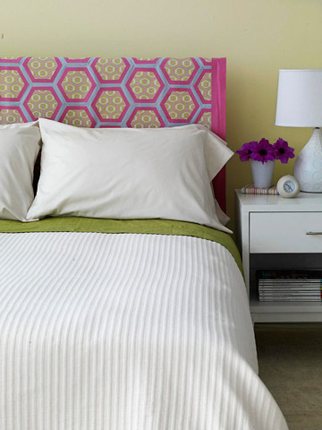
The colorful honeycomb pattern on this fabric headboard really brightens the room and adds a playful element to this fresh bedroom.
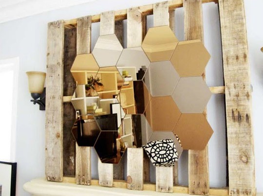
This brilliant honeycomb mirror is mounted on a used pallet and placed over the mantel in a cozy little living room. The silver and amber-colored mirrors really create an eye-catching focal point.
Images 1 | 2 | 3 | 4 | 5 | 6 | 7 | 8
What do you think of honeycomb patterns? Do you use any in your home designs? Let us know! And be sure to stop by Arcadian Lighting for a wonderful selection of gorgeous lighting fixtures and wall lamps!
Living Room Decor Refresh In Time For Spring
I’ve worked in Home Decor for a couple of years. When I started I thought four seasons of home furnishings per year was ridiculous. Why would anyone need to refresh their home seasonally? This isn’t clothing worn out in public we’re talking about, it’s the look of our home – and unless we entertain on a regular basis who really cares if our living room textiles are so Fall 2006?
I’ve learned that people do refresh their home decor on a fairly regular basis.
Add some freshness to your apartment by following some on the best Home Decor looks for Spring 2011.
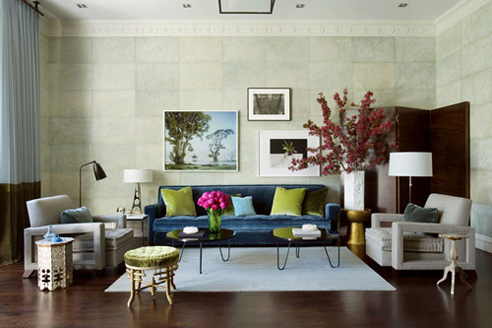
My eye is automatically drawn to the intense color of the suede sofa and pillows. The designer paired the smaller sized sofa with larger, neutral color side chairs; a safe and smart move. The best part of this room is the artwork. I like how the art doesn’t seem to go together very well, yet looks fantastic. This to me is a bold move that we don’t see people take too often.
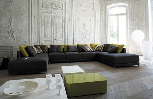
This room itself is fantastic. The color of the walls blends very nicely into the light wood floors. There are so many patterns going on in this room without the furniture. This basic, gray designer sofa is a great piece for the room. Additionally the fact that the colors are extremely limited help focus attention on the important elements (the walls and the floor).
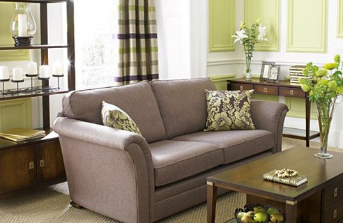
The furniture and decor in this room work well for the small living space. The coffee table and accent pieces are not to dark, heavy which helps them appear smaller than they actually are. To add some life to the space the designer pulled in some great prints that compliment each other well without created a clutter feel.
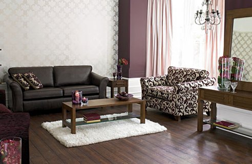
This spacious living room gets it’s personality from prints. The walls have a tan and white motif wallpaper (wallpaper has sure made a comeback). The contrasting print side chair is filled with personality. These pieces, along with the toss pillows bring life to an otherwise sparse and stale living environment.
Which look suites you best? I prefer the blue sofa and mismatched wall art look.
QCLOCK TWO
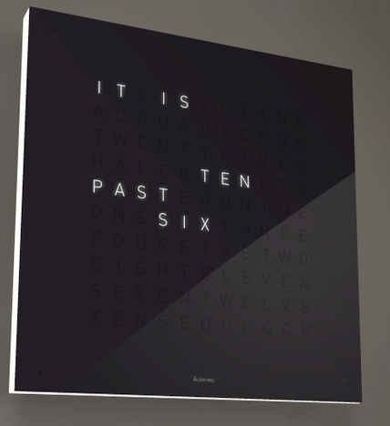
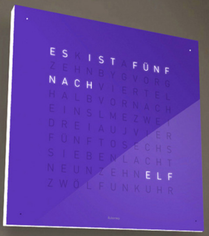
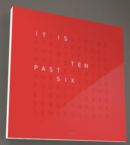
An interesting clock concept. concept. The QLOCKTWO clock posts words instead of the figures for keeping time. The minutes are indicated by LEDs. Conceived by Biegert & Funk and baptized Qlocktwo, it is already available in several colors and various languages for the heavty price tag of $1,400.
