Posts tagged home decor
Décor more
Every once and a while I go through phases where I’m addicted to looking at home decor magazines and home decor websites – hoping to find some inspiration to spruce up my home.
For many years, I’ve had a thing for dimly lit spaces, oversized furniture, and darker hues. But lately I’ve been drawn to muted walls with vibrant pops of color, mismatched furniture mixed with Scandinavian minimalism – making my current apartment not that appealing to me.
While I have some great end tables, lamps and vintage artwork – my apartment is definitely lacking a sense of overall style. But I’m hoping with just a few updated pieces, I can create a cozy oasis just in time for the cooler months (when most of my time is spent at home).
Instead of buying a whole new set of furniture – try rearranging your space, paint a wall or a door, opt for new curtains or add some interesting pops of color. Stop by a local flea market for some great accent pieces – you’ll be sure to find mirrors, frames, end tables and kitschy items (for that much needed touch of personality). Also, be sure to visit websites like, Pinterest and Decor8 for some inspiration and easy DIY projects.
Just be sure you know the overall look you’re going for and with just a few easy fixes – voilà – you’re home will feel fresh and new!
Crane and Canopy Launch Party
Bay Area-based Crane & Canopy debuted just last week with a collection of ten San Francisco neighborhood inspired bedding designs. Congratulations to founders Karin Shieh and Christopher Sun, who have pioneered a remarkable new line for the home goods market. With a beautifully simple business concept and a smart, tech savvy, and user friendly interface to boot, the sky is the limit.
See more of the attractive details and photos in Nicole’s post from a few days ago.
The launch party hosted some forty or so friends and family, including yours truly, in addition to Crane & Canopy staff at Axis Café to celebrate the company’s official online opening for business.
The party, just like their signature product, was simple, elegant, and well-styled. Beds in an understated garden were romantic, not fussy. It was a typical San Francisco night and the air was brisk, making the bedding all the more tempting. Somehow, I managed to resist wrapping myself up in the dozens of beautiful options around me.
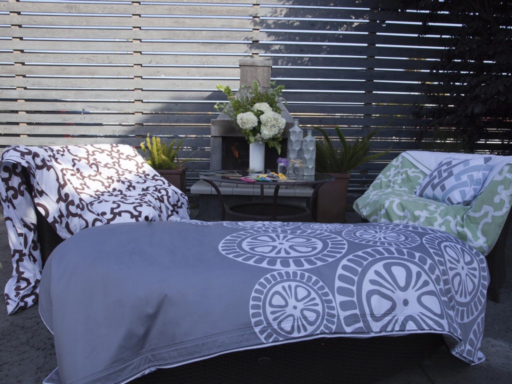
In scoping out the signature designs and stats ahead of the event, I admit I was intrigued and maybe a little incredulous. A new eCommerce store that cuts out the middleman but still manages to produce an excellent high quality product – was there a catch?
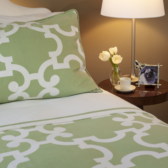
Setting my disbelief aside, I met the products in person, and the quality spoke for itself. Being able to see and touch the bedding first hand, I appreciated that the goods fully lived up to their promise — in every style, the textiles are top shelf in quality. Everything looks and feels luxe. All bedding is made of durable long staple cotton in weaves of 300 to 400 Thread Count. In addition to incredible fabrics, the line includes unique and exquisite details such as tailored edge piping and original embroidery.
If you don’t believe me, ask Gus, Crane & Canopy’s resident pug. Once he gets comfortable he’s apparently impossible to move!
The current ten designs break down into four categories: Geometric Shapes to Classic Solids, Elegant Florals and Delightful Textures. Stay tuned, Crane & Canopy plans to unveil a new design every two months so your bedding always stays fresh whatever the season and on point with changing fashions and trends.
Additionally, form meets function. Their signature duvet cover includes easy ties at the corners to ensure your duvet stays put from the inside. Instead of buttons on the sides, this duvet uses a patented hidden closure positioned on the front of the duvet for better access. What’s more, you can have the layered look, where the flat sheet appears to be folded over like you have your own hotel turn down service. Here you get the look with laissez faire effort. Check out the video featuring the handsome Noe Green bedding.
Crane & Canopy’s talented designers come from a variety of industries including home goods, textiles, fashion and interior design. Lead Designer Johnny Moallempour, who has roots in fashion and a long-standing interior design background, was among the crowd. What SF neighborhood might inspire the next design? Lucky for us, Crane & Canopy takes suggestions. Indeed, Johnny encourages it! Just ask.
Crane & Canopy: Quality Home Decor At Attractive Prices
San Francisco based Crane & Canopy launched earlier this week as a new online retailer in home decor.
What was the impetus?
When I purchased my first home, I wanted to decorate it with superior quality and beautiful designs at a price point that didn’t make purchasing home goods seem like an investment… I talked with many of my friends who were also decorating their homes, and almost all of them were frustrated by the same things – expensive price tags and limited selection of affordable styles. That was my ‘aha!’ moment for creating Crane & Canopy. Karin Shieh, co-founder and head of marketing at Crane & Canopy.
Shieh and partner Christopher Sun are using the “no middleman” approach to eCommerce, a trend that seems to be sweeping the retail industry. This direct-to-consumer model allows them to sell department store quality and design at attractive price points. High quality at low prices should appeal to their target market: young, urban females. I’m thinking their market is probably a lot like you and me: shoppers of West Elm, CB2, and local decor boutiques.
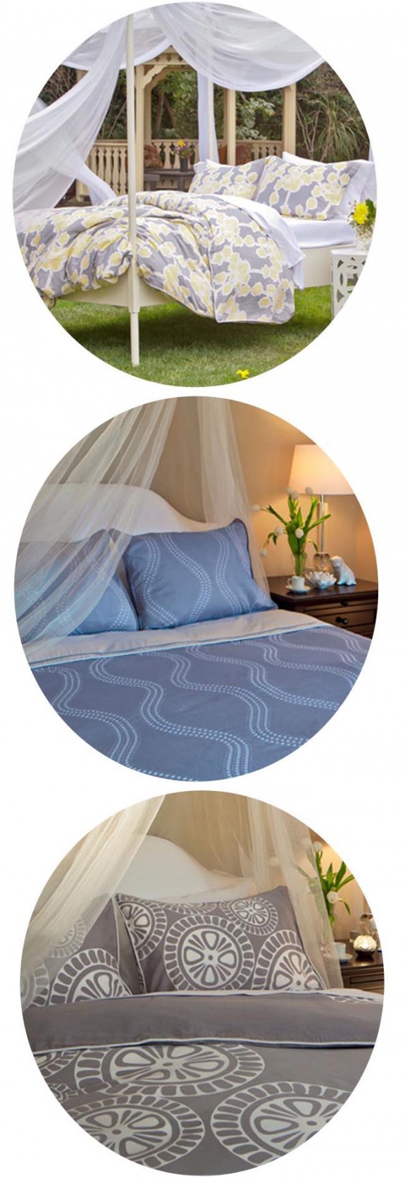
The company launched with their inaugural bedding collection inspired by San Francisco neighborhoods. Why bedding? After conducting research, Karin and Christopher learned that shopping for bedding is a big pain point for women. Check out some of my favorite designs:
top: The Ashbury. middle: The Sunset. bottom: The Marina blue.
Crane & Canopy Bedding Details:
- Signature two-toned duvet is an easy solution for dressing up any bed.
- Standard duvets have hidden zip closures and ties to keep the duvets in place.
- Prices start at $99 for a queen/full sized duvet cover.
- Bedding features 300+ thread-count, 100% cotton, extra long staple cotton.
- Sizes range from Full to Cal-King.
Trends For the Kitchen – What’s Cookin’ For 2013
I haven’t bought a home, or anything bigger than an armoire, but I hear that the kitchen is often the selling point in a house. It makes sense. A lot of time is spent in the kitchen. Whether or not you’re buying a house, kitchens are the most heavily trafficked area of a house. A lot of hanging out and entertaining occurs here – so keeping the look modern is important. I’ve complied the up-and-coming kitchen design trends for 2013. These trends are perfect for bespoke cheap kitchens and kitchen remodels.
The new neutral – Designers are replacing the basics: white, cream, tan, and gray with green. You heard right, you can use green as your new neutral. Build a beautiful palette of colors around green!
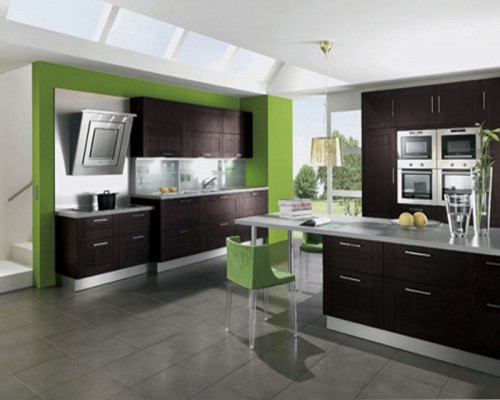
Light the room – LED lighting is a real trend taking hold in kitchens across the country.
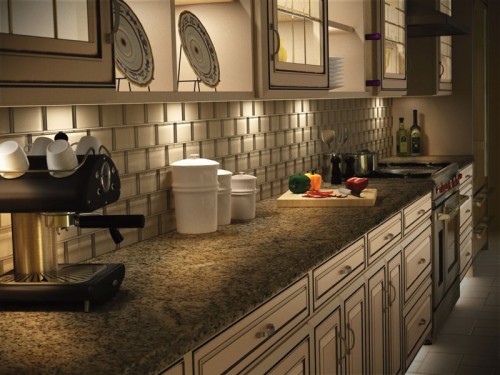
Non-traditional woods – Steer clear of cherry and maple woods. Alder, birch, oak, walnut, and bamboo are the new norms for cabinetry.
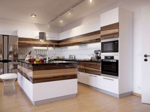
Hide it away – Integrated appliances like drawer-style fridges, and fridges, ovens, microwaves and dishwashers fronted to match the cabinetry give a clean look. We can now hide most of the ‘operations,’ and our kitchens.
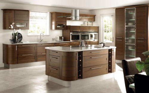
Mixing it up – Designer David Bromstad says a collected, eclectic look is all the rage in design right now. Mixing kitchen finishes is a great way to get the collective look.
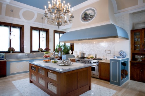
Nostalgia – Wall murals and prints work great as small focuses between cabinets and behind breakfast nooks.
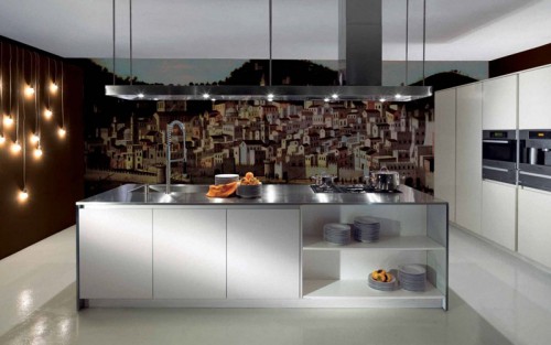
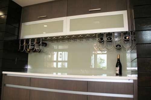
Glass backsplashes – No seams, no grout, easy to clean—what more could you want? How about luminous, reflective colors? Back-painted glass backsplashes win on all counts.
Style meets the home
As we all know, fashion is all about trends. As much as I love to see certain trends and styles – you’ll rarely see me wearing something in “tangerine tango” or floral print pants – I love my basic v neck t’s and skinny jeans too much!
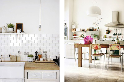
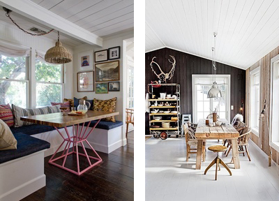
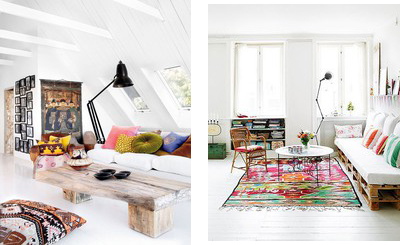
Having that said, I believe that your home truly represents who you are and ultimately … your style (or maybe it’s my obsession with Pinterest that has got me on this home decor kick). While browsing some of my favorite home decor sites and bookmarking my favorite styles – I realized that I am naturally drawn to clean lines, rustic accents, vintage furniture and pops of bold color for the home.
The Kitchen
The Dining Area
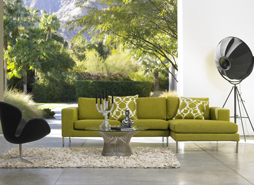
The Living Room
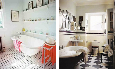
The Bathroom
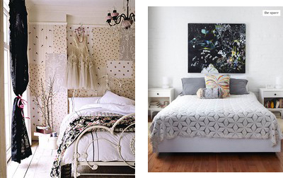
The Bedroom
Although my home looks nothing like any of these photos, I’m hoping that once I move out of my one bedroom apartment, I can start fresh and find special and unique furniture that suits my style.
For a little home decor inspiration and tips, visit some of my favorite sites: decor8, 7th House on the Left, Apartment Therapy, Material Girls and of course Pinterest.
*All photos via Google images
Retro Decor For Your Home
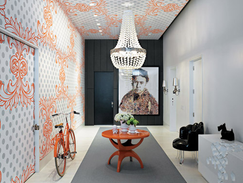
Creating a Hollywood Glamour / Mad Men Era / Retro home environment is a great way to add excitement to your home thanks to the bright colors, engaging patterns and the funky feel that are pertinent to the style of the 1960’s. Don’t be shy, show your nostalgia for one of they greatest decades…here are some ideas for how you can get the retro look at home.
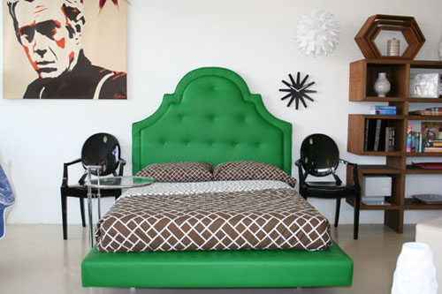
Incorporate curved period style furniture into your home. Curved upholstery in bold colors or geographic prints fit right into the 1960’s period design scheme. A curved headboard is a great way to accomplish the 60’s vibe. This bedroom is made complete with the graphic print bedding, side chairs, graphic artworks and honeycomb decorative details.
Add feature furniture to your living room. Buy a retro sofa and side chair that are so brilliant they deserve to be the center of attention. Play down all surrounding decor and furnishing to help ‘feature’ the furniture. Keep walls and rugs neutral in color to complete the look.
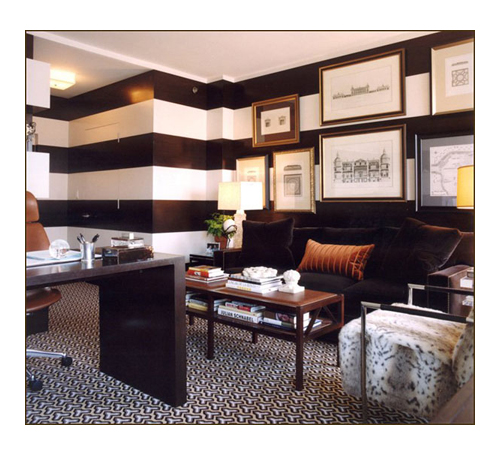
Paint walls with bold stripes, creating a two-tone effect using one dramatic hue for pure impact (black and white is solid choice). Finish the look by adding statement decor, and solid color furniture.
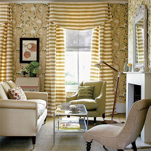
Mix and match patterns to successfully complete the vintage family room scheme. Make sure the mix and match color palette is complementary. Geographic prints should be mixed with other graphic prints, stripes and solid colors. While florals should be mixed with other florals, stripes and solids.
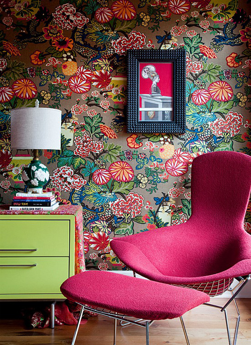
Choose large scale floral prints for your walls and fabric. The floral wallpaper effect is best pulled off on high-ceiling rooms because they have more space to display the pattern. Keep color palettes simple in rooms with colorful floral prints.
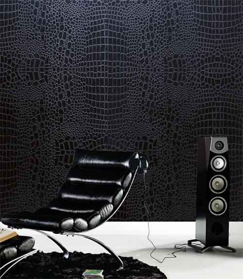
Give your wall a 3D effect with textured wallpapers. Textures create the perfect amount of stylishness without looking over done. This is my favorite look from the 60’s. Someday my house will be covered with textured walls (and hopefully leather walls).
Incorporate a statement chandelier for the ultimate Hollywood glamour lighting.
To make your home decor interesting, learn about more Hollywood Glamour styles at UKTV and try to reinterpret them with help of modern materials. Or you can do the opposite and try and make modern things look a bit retro!
Home Away From Home: Indulgence Divine, Malta
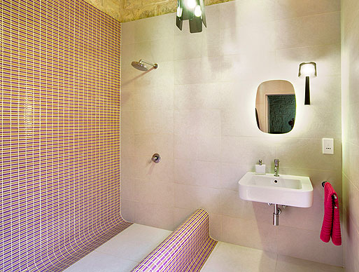
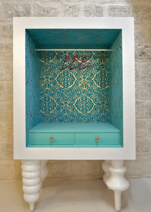
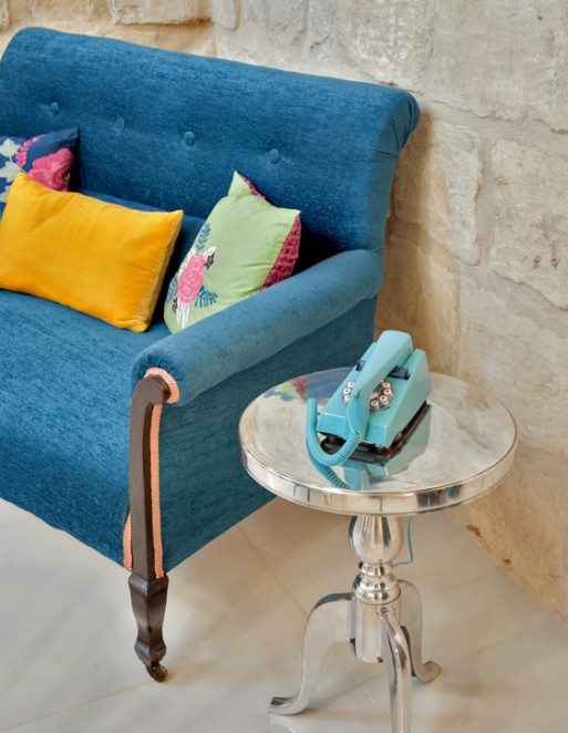
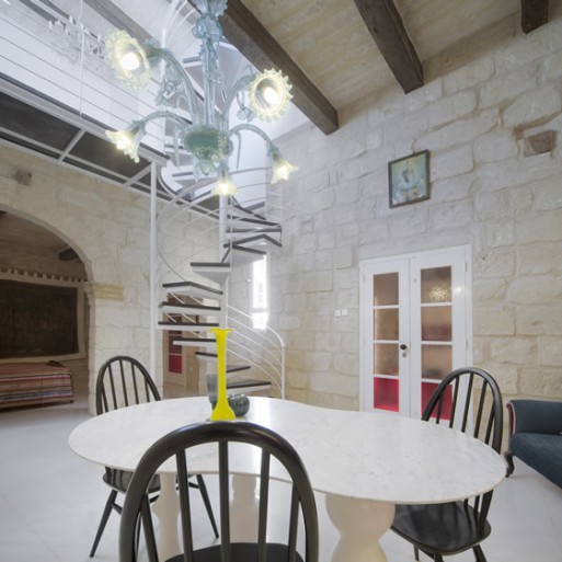
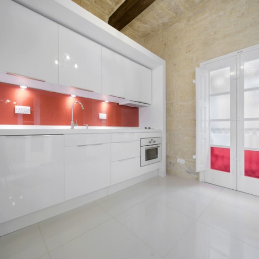
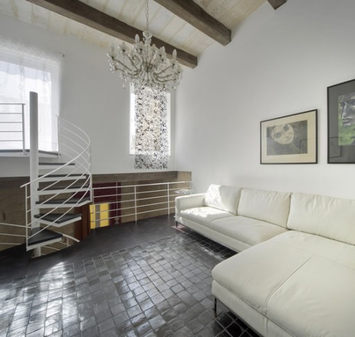
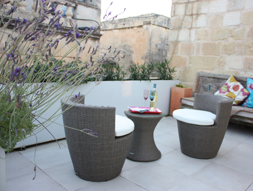
I’m in love with the retro beauty of Indulgence Divine, a 16th century townhouse rental in the ancient Maltese city of Vittoriosa, Malta that has been transformed to a modern-day residence by London-based art director Gattaldo. Throughout the townhouse custom-made furniture sits comfortably alongside retro “found pieces”, yet the history of this 16th century house aren’t diminished by its luxe overhaul by Gattaldo. This is the prefect home away from home retreat for two (there is only one bedroom). Indulgence Divine is a perfectly chic rental residence from which to explore Malta, the up-and-coming island that is somewhat of a secret party destination. The townhouse is located in the beautiful historic marina, and the staggering capital of Valletta. Just a short water-taxi ride away – Malta has some of the best architecture in the Mediterranean. Throw in a delightful rooftop terrace, and quite possibly the nicest wardrobes I’ve ever seen, then top it off with an affordable nightly rate, and Gattaldo’s splendid town house conversion may just be one of Europe’s most desirable rental properties.
Image source: Indulgence Divine
Honeycombs In Your Home
Hi there! I’m Jessica, a writer for Arcadian Lighting. Every day I get to discover beautiful, inspiring interior design ideas and light fixtures, and then get to share them with blogs like Style Bust.
I’m going to be sharing a wonderful design trend that first became popular in the 1960’s – honeycomb patterns! They’re fun, versatile, and classic. I hope you enjoy!
These creative DIY honeycomb shaped shelves combine style with functionality. The geometric honeycomb shape is interesting and unique, while also providing cute little ‘nooks’ to display your favorite pieces of artwork, tchotchkes, knick knacks or photos.
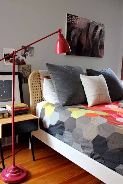
A colorful honeycomb patterned quilt gives this bedroom a fun, vintage feel. The quilt was made using old clothing – a perfect way to recycle what you already have, while making a colorful accent for your bedroom. The red floor lamp is just the right color for this room, as well.
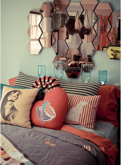
This very eclectic bedroom features a honeycomb mirror that’s offbeat and unexpected. I love all the quirky accents, especially the strange pillows.
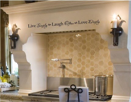
The neutral colored honeycomb backsplash in this kitchen is an interesting accent that draws on the ‘homey’ feeling of a beehive. I particularly like the modern touch of adding written words above the stove.
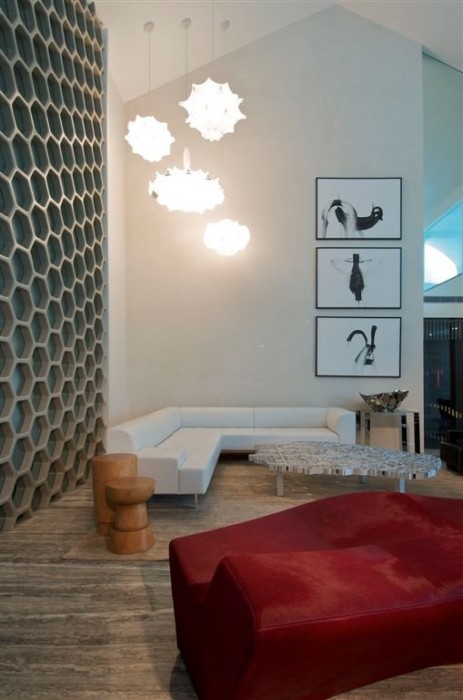
This cool and contemporary living room features a whole wall of honeycomb patterns in a fresh grey and pale blue palette. Random ‘combs’ have clear glass panels, allowing a fun way to see through to the next room. The organic shaped pendant lights are a clever touch, as well.
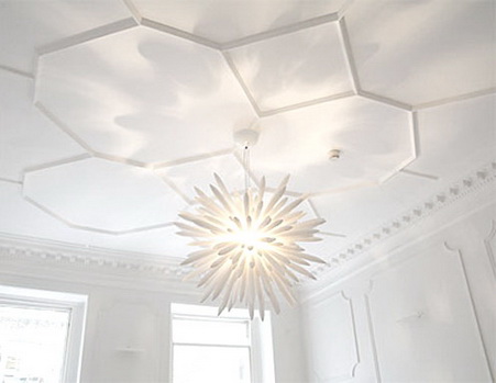
Honeycomb moulding is a particularly stylish and unexpected accent in any room. This ceiling adds a bit of texture and interest to what appears to be an all-white room.
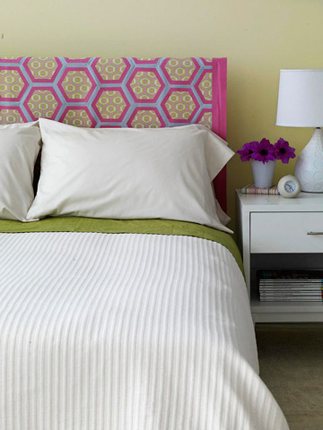
The colorful honeycomb pattern on this fabric headboard really brightens the room and adds a playful element to this fresh bedroom.
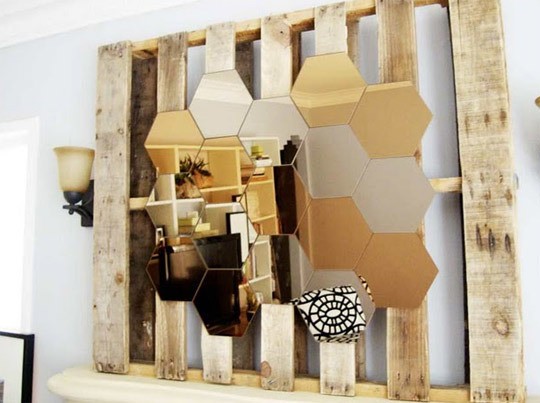
This brilliant honeycomb mirror is mounted on a used pallet and placed over the mantel in a cozy little living room. The silver and amber-colored mirrors really create an eye-catching focal point.
Images 1 | 2 | 3 | 4 | 5 | 6 | 7 | 8
What do you think of honeycomb patterns? Do you use any in your home designs? Let us know! And be sure to stop by Arcadian Lighting for a wonderful selection of gorgeous lighting fixtures and wall lamps!


