Posts tagged color
Matching and Choosing the Best Color for Your Skin Tone
11 years ago
There are an awful lot of people walking around in fashion colors that they simply love, but that look devastatingly horrible on them. The usual reason for this is that they have selected a favorite color that simply doesn’t compliment their skin and hair color. No matter what we may love, some colors and shades look better and others can be a disaster.
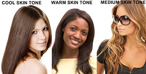
The general rule of thumb for colors that match skin tones relates to the seasons of the year: spring, summer, fall and winter. Winter colors are usually of the lighter skin tone variety and your colors can include yellow. Darker tones for winter include anything with a blue or pink blend. Black can look great, but the browns are shades you need to stay away from. Pinkish skin tone means you are a summer and you should be wearing pastels. Keep away from Halloween colors (except on the holiday). Autumn skin tones usually fall into the category for people with auburn, red hair and brunettes. The best colors for autumn people are oranges, browns and earth tones. The worst selection is black or white. If you are a lighter skin tone, you are a spring and your colors are greens, yellows and blues. Stay away from black and white, as they will not do you justice.
(more…)
Colors: the Do’s and Don’ts and How to Wear
11 years ago
Color is part of our world, and each one of us has not only a personal favorite color, but a palette of colors that we look best in. This does not mean that these two choices are always the same and they can actually clash terribly. Color can be a reflection of a mood, a moment, a fad and a time and which color we select can be an important topic.
The lives of celebrities seem to dictate what colors are right to wear (and not) and doesn’t seem to deter people (including celebrities) even when the colors and patterns are poorly chosen. The colors and shades of blue are here to stay, in variations that require almost a palette of their own. Ocean blue, deep rich navy blue and pale pastels are currently incredibly hot and designers are taking that into the next year. But there is such a thing as too-much-blue. Choosing a very boho dress in shades of blue, then adding more blue for shoes and even more blue for a matching headband is going overboard. Now don’t get me wrong, with some shades, especially pastel solids, this can be accomplished to bring a fresh airy look and feel.
(more…)
Color Blocking – The New Rules On How To Dress Loud
12 years ago
Summer is prime time for exciting bursts of color, fusing shades and explosive floral – and that’s just on your clothes! A trend that keeps coming back and only seems to get brighter and bolder is color blocking. So whether it’s petite, casual, formal or plus size clothing you’re after, read on to find out how to make colour blocking work for you.
There’s been a lot of talk about this trend adopting an ‘anything goes’ attitude, with no rules. There shouldn’t be an absolute carte blanche for colour blocking; otherwise you’ll just look like you’ve got dressed in the dark!
Thankfully, we’re here to tell you how to get it right!
How many colors?
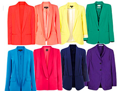
Ok ladies. First up there is a limit to how many colors can be worn at once. Four or more different colors worn at once will make you look like a walking rainbow, which is never a good look. The basic idea is to mix colors that are not under one tone. If you’re new to color blocking and feel a bit nervous, try limiting your outfit to under two colors at first, and then build up to three when you get the hang of it.
Setting the tone
Color blocking in summer 2012 is not only about different tones but also totally different ones – think mixing pastels and neon, such as mint and lime, and you’ll be right on trend.
Work with solid colored pieces
DON’T try and add prints and frills to your color blocked outfits (to start), what you really want to do is emphasise the bold, striking colors of the outfit, and so don’t want anything to distract the eyes. Texture is firm friend of color blockers. Texture is preferred over prints because it will give your outfit dimension. For example, a mint chiffon blouse with lime skinny denim jeans would look great.
Accessories
When accessorising your outfit don’t wear jewelry that’s of the same shade as your outfit. We’d stick to nude tones, like black and white, and it won’t detract from your outfit.
Shades we love
If you’re still stuck for inspiration, bear these combos in mind when next perusing the high-street:
Tangerine and candy-floss pink with ice cool beige.

Slate grey with citrus, coral, fuchsia and electric blue.

Finally… be confident! Color blocking is all about being daring and looking vivid, so don’t be afraid to stand out from the crowd!
Tangerine Tango – a state of mind
12 years ago
It’s June (halfway done with 2012 – gasp!) but as summer approaches Pantone’s color of the year Tangerine Tango continues to inspire.
Maybe it’s my wanderlust and affinity for mid century modern style, or simply that market researchers have successfully affected my consumer behavior. Regardless, I am starting to believe Tangerine Tango is not just a color of the moment but also a way to be.
Check out these examples from fashion to beauty to interiors for a year-round energy boost.
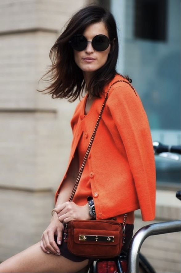
I love this ladylike cardigan in a tangerine hue, which punches up the whole look, and the pairing with a sporty watch and sartorial shades.
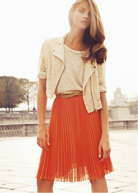
I am perpetually on the hunt for a beautiful black pleated lady-like skirt, but now I’m totally rethinking my approach. Tangerine raises the flirty factor of this classic A-line pleated skirt. Paired with a lacy creamy motorcycle jacket and tee – the colors, textures, and pattern are balanced and bold.
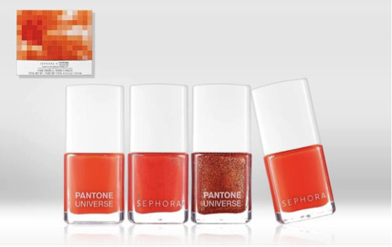
Try this shade and take your nails from spring to carefree summer. I love this color on toes, too!
Any one of these tangerine pieces can perk up your daily routine. Organize documents with a fun and cheeky attitude to boot.
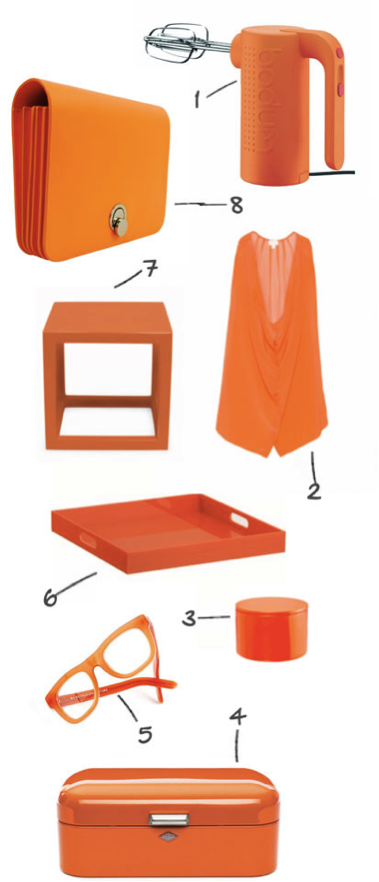
Energize your home with touches of tangerine. This deeply saturated hue pairs nicely with neutrals like gray, white, or gold. It also complements other strong hues like turquoise or plays up soft shades of lavender.
This sunny reddish orange color with yellow undertones encourages optimism and courage. And there’s no time like the present for this fun energetic state of mind.
Favorite Color Combinations
12 years ago
Day Two of my 30 Day Lifestyle Blogging Challenge is about my favorite colors. Those of you who know me well know I have a ton of muted solids in my wardrobe – and hardly anything else. My closet wasn’t always stacked this way. Over the past few years I’ve refined my wardrobe in hopes of pulling off a more mature, professional look, and that’s where use of solids and subtle prints came into play. Right now I’m all about neutrals, and shades of green. Here is a palette that works well for me. The colors complement my fair/olive skin, green eyes and dirty blonde hair. Bonus: these colors are on trend through 2012!

Of course, I like Black Coffee the most. I think I could live in all black every day of my life and just accessories with bright, stand-out pieces. Tyler (my husband) doesn’t understand why I wear so much black, or why I have so many LBD’s. I don’t have a good answer – I just think black looks chic and clean (until it fades and becomes trashy).
Spring & Summer 2012 color trends
12 years ago
The foundation of any season’s collection are the colors and hues that underlie them, shape them, and eventually come to define them.
Interfiliere Paris is always the first to release their take on any season’s color trends, and for spring and summer 2012 it’s no different.

Interfiliere has also grouped their color trends for spring 2012 into different moods. For the spring / summer 2012 season they’re seeing three distinguishable color groups: tender, earthy, and floral.
Tender: The clearest and palest of pastels, ideal for lofty and silky fabrics and for a new vintage mood that is more sexy than candid.
Earthy: The earth hues: ochres, oranges and copper tones which support the passion for nature and organic environments to use with mat or shiny effects, with top-of-the-range laces, and for beachwear. Note a surge of ‘hand-dyed’ effects, especially indigo.
Florals:Floral tones, essential nuances for charming prints available now for ranges of limited volume.
Spring 2011: Rust Bucket
13 years ago

One of the top colors hitting the shelves this Spring is rust. I’m ecstatic about the color. Not only do I own a handful of tops in this color, I also believe it looks good on nearly every skin tone. I darn you to disagree with me on this one! Beside the color being flattering for all, it also pairs well as separates. Rust goes with all other earth tones, denim, black, shades of grey – the opportunity for mixing and matching rust are endless.
I’ve found that rust also looks fantastic in the home. Wall color, leathers, bedding, sofas, dinnerware, flowers, table textiles, throws, etc. all come in a variety of great rust earth tones.
You can really do no wrong by getting into rust!

Colorblock Thursday
13 years ago
Who doesn’t love a little color to get them through the grueling workweek.
Here are some of my favorite color inspirations today!

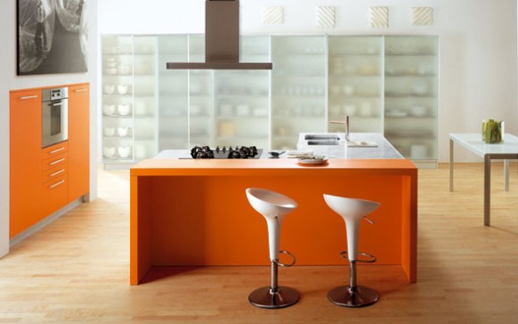
This might as well be called the Pantone color kitchen. I really dig this look, especially with the strangely clean counter and tabletop. I think the look could easily go south if countertop appliances and accessories aren’t white, great or a very basic color. I admire anyone who can pull this look off int their kitchen!

Here are some of the best of the best colored pieces this year.
- Sergio Rossi Block-Color Sandals, $277.50, available at Outnet.com
- Forever 21 Colorblocked Sheath Dress, $13.99, available at Forever21.com
- Balenciaga by Nicolas Ghesquière Leather Sandals, $1,495, available at Balenciaga Boutique NYC
- Derek Lam Colorblock Dress, $1,390, available at Barneys.com
 Finally, so fun way to play up an otherwise white bedroom.